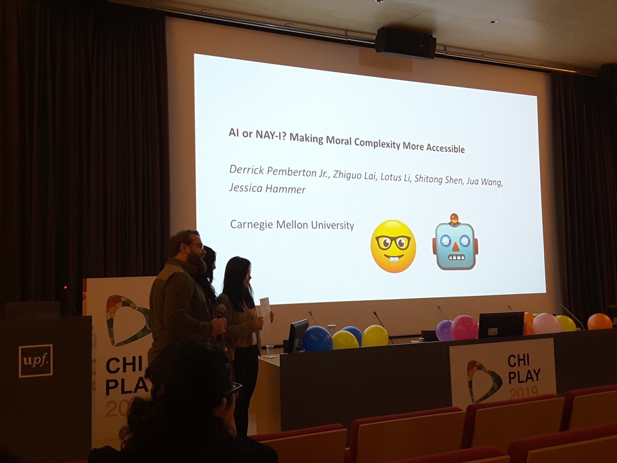
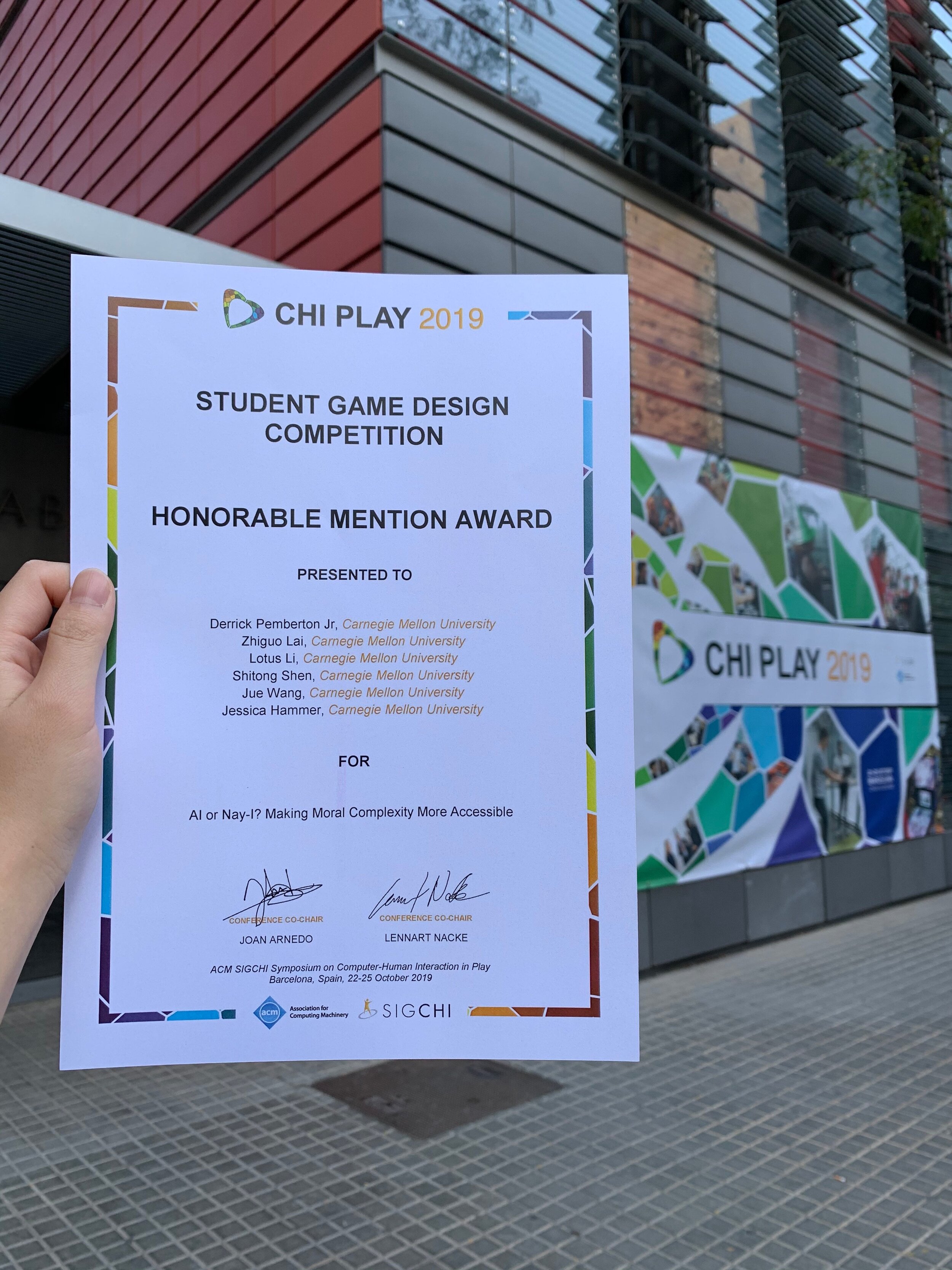
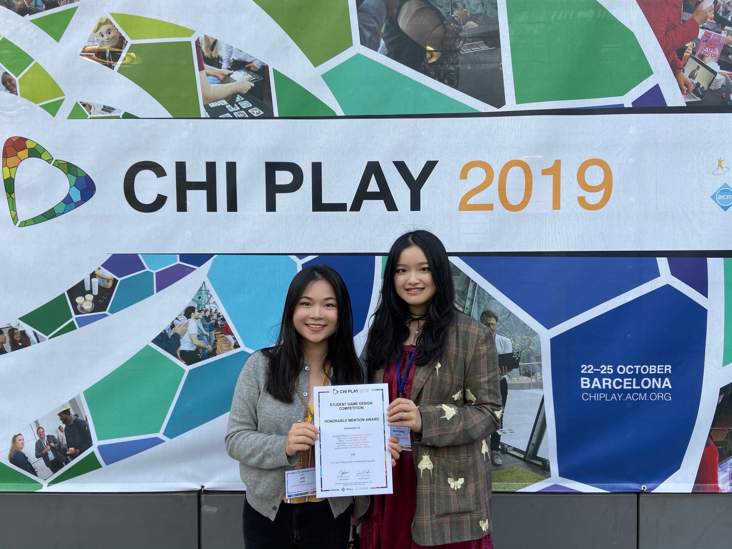
On October 25, 2019, AI or Nay-I? was awarded Honorable Mention in the Student Game Design Competition at CHI Play 2019 in Barcelona, Spain.
Embracing VR-ness in Astro Bot: Rescue Mission
These days, it’s rare to play a game with a crystal clear sense of purpose. With Astro Bot: Rescue Mission, Sony’s Japan Studio set out to prove that 3rd-person VR platformers can be great. Luckily for us gamers, they did a bang-up job. In hindsight, this may seem like an obvious choice, but JS did more than just copy and paste Super Mario 64 into a VR space. Astro Bot: Rescue Mission is the first truly great game of its kind on PSVR. Though many things make AB:RM great, in my view its success rests on how Japan Studio thoughtfully designed the game specifically for VR.
The Player Is The Only Camera
Astro’s foot lasers help players line up tricky jumps.
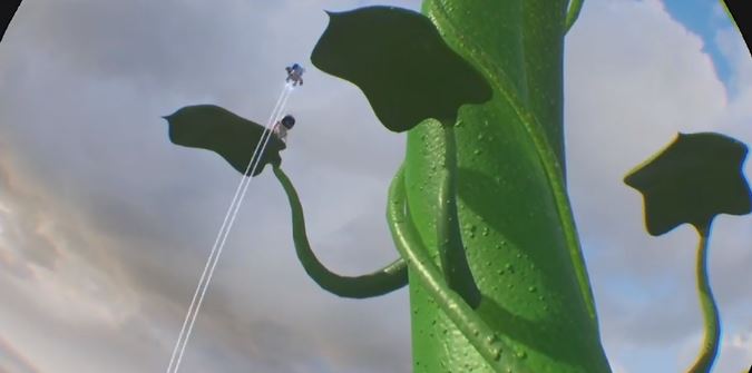
Once Japan Studio made the decision to forgo the classic two-stick camera control for 3D platformers, they needed a replacement system. They soon realized that in order to utilize the full potential of VR, the player should act as the only camera. Instead of using the right stick to adjust the camera, they explored fun ways for the player to use their body. Perspective play encourages the player to lean and find surprises. Enemies or coins will peek out from behind walls, acting as hints to lean and look. Every level has moments like this because leaning compliments platforming well. Similarly, vertical play forces the player to look up and down. Oftentimes, Astro will fall to a platform way below the player, then after some action he will hit a jump pad and shoot up, pulling the player’s gaze along with them. . Translucent platforms above the player let them keep tabs on Astro at all times. Enemies will emerge from the sky or the dark depths of the ocean. Other enemies are stacked on top of each other creating intimidating battles.
Hey there little man
In addition to verticality and perspective, there are many moments where Astro comes nose to nose with the player. Near play like this where the player sees all the details of their little buddy is extremely powerful. One of my favorite moments took place in one of AB:RM’s water levels. Astro swam right up to my visor and actually got stuck to the glass. He awkwardly waved and giggled before swimming away. In contrast to near play, levels also include moments where you send Astro far off in the distance. Sometimes you send Astro into a long, narrow cave to rescue another little bot. Other times, Astro will walk on the outstretched arm of a giant robot as you move along with him. Moments like the giant robot sequence play like 2D platformers due to the removal of depth perception.
The last kind of play is 360 play encourages the player to turn around. These moments are used more sparingly because turning your head around isn’t comfortable for a lot of players. There is only a handful of moments where Astro must move behind you, otherwise most of the action takes place within a 180 degree field of view.
Bonding With Your Bot Buddy
In addition to styles of play that Astro encounters, the players themselves perform many actions and develop a bond with their little robot buddy. Players can see their own body in mirrors and shadows. The player robot’s body is stretchy and a joy to move around. Players often use their head during gameplay, like dodging traps or enemies, headbutting objects, and even blowing air using the headset’s microphone. Furthermore, players make eye contact with Astro himself. I must’ve giggled every time he looked at me with his big eyes and waved, which happens A LOT. Other NPCs, like flowers and enemies, also make eye contact with the player. The constant eye contact validates the player’s place in the world and reinforces the empathetic bond with Astro.
Go-Go Gadget Dualshock!
Players create platforms for Astro with shurikens.
The player’s head isn’t the only way they interact with astro and the environment, the controller also houses a handful of gadgets. Effectively, all gadgets are different kinds of guns. Players shoot water, shurikens, balls and even light. These aren’t just fun toys, but each gadget is a multipurpose compliment to platforming. Many levels use a hookshot that creates a tightrope that Astro walks on. Players bounce Astro by moving the controller up and down. In a dojo themed level, players sink shurikens into wooden conveyor belts to act as platforms for Astro. The gadgets allow players to approach platforming challenges in many creative ways.
Every art form struggles to adapt to new technology but inevitably, pioneers forge a path. Be it silent films to talkies or, more recently, 2D games to 3D games someone figures it out and lays a groundwork for the rest of the industry. For me, and many others I imagine, Astro Bot: Rescue Mission has shown a way forward for 3rd person games in virtual reality.
Experience Boost: A GDC Postmortem
I made my decision to attend the Game Developer Conference long before the I attended my first lecture at the ETC. I came into the program with the game design fairy whispering into my ear. The fairy pushed me to explore the industry for a slot that I can comfortably fit. Now with GDC 2019 behind me, I still don’t have a specific role other than “game designer,” but I feel like I’m finally looking in the right place.
Initially, I planned to attend talks all day, but over the course of the week, I discovered that is not sustainable. By treating GDC as a strictly educational retreat, I was ignoring what ended up being my favorite aspect of the conference: the community and the people that make it-but I’ll get to that later.
Among the talks I did attend, I can easily name my top two. Early in the week, Ken Wong, the creative director and founder of Mountains, gave a talk titled “Letting Go: A ‘Florence’ Postmortem.” Wong discussed the journey of designing Florence from the project’s inception, through its turbulent design evolution, and how the game achieved its emotional power. On Friday, Cory Barlog, Creative Director at Sony Santa Monica, gave a twofold presentation on 1) his experience pitching the reimagined God of War and 2) his experience struggling with doubt through the development process. Both talks examined the wild ride that is the creative process and the unique problems that arose for each team. Ken Wong struggled with over-attachment to ideas while Cory Barlog struggled with the inverse, doubts. I too struggle with both sides of this coin every day, and I’m positive everyone in the Moscone Center that week does as well. I found profound comfort by acknowledging how similar Wong, Barlog, and every creator at GDC are. Though the challenges will always be there, at least we are all attempting to conquer them together.
Other talks of note include: Bryan Intihar’s talk on Insomniac’s Spider-man game, a game design workshop exploring the MDA method of design, a workshop on designing ethical dilemmas, and level design talks from Santa Monica Studios and Insomniac.
The Blacks in Gaming event took place on Wednesday evening. Before the event started, I was a ball of insecurity and excitement. I had never met a black game developer before and I feared that the community would keep me on the fringes. I have historically struggled with this form of imposter syndrome due to my light tone effectively camouflaging my true mixed race nature. Thankfully, my anxieties were unsubstantiated, as they often are. I was welcomed with open arms. It may have been the Solange playing through the speakers or all the free beer (Thanks Microsoft!), but around these wonderful people of color, I finally felt comfortable, inspired, and self-actualized.
By the time Thursday came around, I had developed talk fatigue. I decided to take it easy the last two days and thoroughly comb the expo floor. I visited all the big name booths like, Epic Games, Sony, Google, Amazon. Off my head, my favorite experiences on the expo floor took place in the alt.ctrl section. I’m a sucker for nontraditional interactions.
At the risk of spinning hyperbole, attending GDC changed me. I would absolutely recommend attending GDC to anyone interested in the industry. I gained heaps of knowledge in the talks and workshops. I met diverse and passionate people. I played plenty of mind-expanding games. I found a community, a home.
-Derrick
Cory Barlog: “Pitching and Doubting”
Ken Wong: “Letting Go: A ‘Florence’ Postmortem”
https://www.gdcvault.com/play/1025694/Letting-Go-A-Florence
Transcending Tetris
Tetris, as it was when I played it on my gameboy cir. 1997, has always been my go-to answer for greatest video game of all time. My argument for this high honor has typically been Tetris’ simple yet addictive gameplay loop in combination with its ubiquity. Tetris is arguably the most recognizable video game in the world. I mean, how many video game titles have been colloquially adopted as verbs?
As great as Tetris is, there’s always been the potential for it to become even greater than its tight gameplay. But how do you improve on a game that for many people, including myself, is near perfect? Some designers have tacked on battle modes or various themes. Some of these versions are interesting but none truly transcend the elegance of the original versions. If we examine the game through the lens of the elemental triad (story, mechanics, technology, and aesthetics), it’s clear that the mechanics are the strongest pillar of Tetris’ design. What about the other three elements? Story is the hardest to crack because it's hard to identify with tetrominos. You could introduce characters outside of the falling block wall, but those would just pull attention away from the mechanics. Beyond story and mechanics, technology and aesthetics have also remained largely unchanged, resulting in a presentation that has been usually unemotional...until recently.
Tetris Effect, named for the phenomenon in which repetitive tasks manifest in our hypnagogic dreams and memories, iterates on the game’s original concepts and adds audiovisual euphoria. The designers at Enhance Games thrust the players into the virtual reality space and immerse them in an experience that merges their actions with sound effects, music, and visual effects.
Visually, Tetris Effect is pure eye candy. Each round of Tetris Effect’s campaign, titled The Journey, is set against a variety of beautiful backdrops, each with their own music and sound effects. The tetrominos shimmer in time with the beat of the music. One moment you will venture deep into the ocean, where schools of fish swim around you and your wall of blocks, the next you will be thrown into deep space. Fireworks erupt each time you clear a line or four.
The sound design in Tetris Effect consists of widely varied original music in concert with tactile audio effects for every interaction the player makes. Each turn, drop, and line clear flows naturally with the music. The speed of the puzzles ramps up and down within each level to match musical transitions. The tempo progression through the whole game isn’t linear however. It feels more like an album. Some moments are serene, while others are intense. Often there are moments where I found myself subconsciously maneuvering my tetrominoes to the beat of the music. I felt one with the experience.
Tetris Effect, is the perfect example of updating a classic game for the modern age. Even though the mechanics remain untouched for the most part, the enhancement of the other elements of the triad pull the game, and the medium, closer to a form of interactive audiovisual poetry.
Ape Out: Improvisational Jazzy Chaos
Ape Out’s pitch is simple: inspired by improvisational jazz, players take control of an ape escaping from various locations where it is being held by any means necessary. This usually means rampaging through your opposition, by tossing them into walls or out windows. But as you continue through the games levels, you quickly realize that Gabe Cuzzillo and his collaborators dug deep into the game’s potential and delivered an elegant design absolutely drenched in style. Ape Out is a perfect example of a game fully committed to its theme: Improvisational Chaos. The game achieves a synergy across all its elements, especially the mechanics, visuals, and sound design.
Ape Out teaches grabbing mechanics by constraining the player in a narrow hallway.
The game plays like a top-down, twin-stick shooter but there are no weapons. Early on in the game you learn how to grab enemies. When holding an enemy you can use them as body shield to soak up bullets. After grabbing an enemy, you can throw them into walls or other enemies in ultra-violent explosions of blood. You can also aim the enemy as they shoot their last remaining bullets in hope of taking out other baddies. You move slowly when holding an enemy though, so, in general, it is better to use this ability in a pinch. The first world has a clever section that teaches you the benefits of grabbing and throwing enemies by constraining you in a narrow hallway populated with enemy characters. This is immediately contrasted in the next area where you are surrounded by enemies, posing a new challenge. This juxtaposition encourages finding a new method on the fly.
Ape Out continues to surprise the player with new enemy types, changing your approach to situations. Bomb enemies will explode if they are shot using them but also explode on impact with other enemies. Machine gun toting foes will cut through a held body shield with no effort, but can take out many other foes when held by the player. Enemies’ behavior is easily learned and the player quickly learns the pros and cons of each enemy type. As a result, the player spends most of their time thinking on their toes, either looking for better positioning or sprinting towards the escape.
Beyond the mechanics, the game stylishly communicates the improvisational theme in its visuals. As soon as the game is booted up, players are shown a loading screen of stop-motion brush strokes rapidly changing. It is immediately clear, that this game is unpredictable and bold.
Each stage has a basic layout that is shown to you every time you die, which is often. However, each individual room and the objects in them is procedurally generated. Players know the general direction they are supposed to go but are still left guessing what’s around every corner. Even the title cards for each level pop in and out randomly.
The minimalist art style presents all the information the player needs to know extremely efficiently. For example, when hit by an enemy, the player’s ape avatar starts to leave behind a trail of blood matching their color. After a second hit, the blood trail grows in size. On the third, the player loses. In addition, enemies are designed to be quickly identified by their size and head wear. The game even displays control directions on the ground, but doesn’t tell you what those button presses do, instead letting the player find out for themselves. Again, the player is encouraged to quickly experiment with the game objects and improvise solutions. The result is an extremely challenging game that feels fair because all the information the player needs is communicated clearly.
The sound design of Ape Out is crucial to its success. Cuzzillo has cited improvisational jazz drumming as the inspiration for the game’s feel. In addition to the obvious reference in the game’s score, music plays a big role in the visuals and structure as well. Each world is referred to as an album. Halfway through a world, the “record flips”, i.e. the game pauses giving the player a break from the frenetic action. Each album takes place in a unique setting, like a laboratory, or skyscraper. In addition, each album has a unique sound design.
In lieu of a traditional soundtrack, the dynamic score is composed of a myriad of drum loops and pre-recorded tracks that play at different times depending on the intensity of the action. Shadowy areas are quieter, encouraging stealth while high speed chases are high tempo and chaotic. Every time an enemy is killed, a cymbal crash is played. In an impressive attention to detail, the game determines the approximate location of the wall you finished the enemy against and determines what cymbal corresponds to that location on an actual drummer’s kit. In essence, you are creating the music by playing the game.
Ape Out is visually stunning, full of frenetic action, and boasts incredible sound design. The game comes together to ooze the attitude of improvisational jazz from every pore. After countless hours of play, I haven’t grown tired of the game and its unique style. Every design decision was successfully made to tie everything together and achieve a beautiful harmony.
Mastering the Remake
If you’re like me, you have been playing games pretty much your whole life. My earliest memories often include sitting in front of my grandmother’s NES playing The Legend of Zelda and Duck Hunt. I remember having my mind blown by the incredible graphics of Ocarina of Time when it got released. At the time, games like Ocarina were radical achievements in technology, but if you were to dust off the old N64 you might laugh at how outdated the game looks and feels.
For as long as games have been around, they’ve been caught in a race with technology. Often still, gamers cling to a sense of nostalgia and want to relive their formative gaming experiences. Luckily, developers heard this desire, and are starting to remake games that were released when I was a kid. This brings me to the question: What are the best ways to design remakes?
It’s worth saying that revisiting old games isn’t necessarily a new idea. Remasters have been commonplace for a long time. Games like Uncharted and Fable have gotten HD remasters to take advantage of current generation hardware. These remasters however, are usually just graphical updates or frame rate improvements. Sometimes, the updates end up looking worse than the original. Even though there are more polygons in Fable Anniversary Edition, the color palette looks bland and washed out compared to the original. Other times, like with the aforementioned Uncharted Collection on PS4, developers improved the gameplay mechanics in addition to aesthetic improvements. Unfortunately, improvements to the systems are often sidelined for more easy visual polish and a quick grab at nostalgia-addicted players’ wallets.
Fable (Xbox) and Fable Anniversary Edition (X360) Comparison
Where remasters reuse the original game, adding a bit of polish, remakes are usually crafted from the ground up. Over the past few years, games like Shadow of the Colossus, Ratchet and Clank, and, most recently, Capcom’s Resident Evil 2 remake have shown that AAA developers are starting to take remakes more seriously. I’ve listed below a couple design practices that have made these remakes so successful.
Modernize Gameplay
As a designer, you must realize that there is a good chance that the players of your remake are the same age that you were when you first played the original. Beyond the obvious visual improvements, Capcom got rid of the infamous static camera angles from the original RE2 and updated the movement with a more contemporary third-person control scheme.
Make Sure New Additions Are Meaningful
In the Ratchet and Clank remake, Insomniac added skill trees to the weapons. This increased the feeling of power when using your favorite weapons while also encouraging players to try out other weapons to see how they would fair when upgraded.
Taking on remakes of this caliber definitely come with more risks and require more resources. But when remakes are crafted by teams that are just as invested as fans of the source material, it can lead to some beautiful outcomes. I’d love to see more remakes treated with the same care that Capcom and Insomniac have given their franchises and given Nintendo’s recent announcement of a Link’s Awakening remake, I’m sure there are many more on the other side of the horizon.
Sources:
Fable Anniversary - Graphics Comparison https://www.youtube.com/watch?v=OX8ugxA-F94&t=1s
Resident Evil 2 is everything a video game remake should be https://www.polygon.com/reviews/2019/1/22/18192509/resident-evil-2-remake-review
The Legend of Zelda: Link’s Awakening - Announcement Trailer - Nintendo Switch https://www.youtube.com/watch?v=_U-_XfDGgDw
“Where We Beyoncé Droppin’ Bois?”: Game Designing For A New Audience
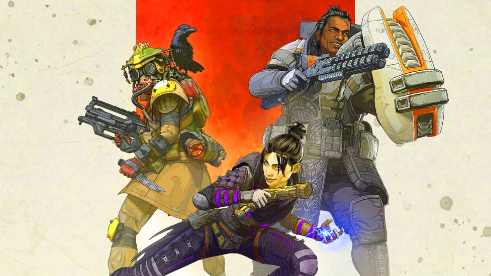
If you’ve been anywhere near a gaming blog or gaming twitter this week, you’ve heard something about a new game called Apex Legends. A couple aspects about Apex’s release caught my attention. The first was Respawn Entertainment’s decision to move from Titanfall, a critically acclaimed series with particularly lauded campaigns, to a free-to-play, squad based, battle royale game with heroes. On top of that, the release didn’t have a hype cycle that AAA titles usually do. Instead, Respawn employed “The Beyoncé Drop”, that is: releasing the game with no public announcement before (or two days notice if you count leaks). A release like this may seem like a gamble, but after examining trends in the game industry, it actually shows some clever thinking.
Apex Legends’ success marks a shift in the way AAA games are being designed and marketed, Respawn took notice of the rising influence of Youtube and Twitch, and decided to target streamers and their viewers as their audience. They took hints from battle royale games like Fortnite and hero shooters like Overwatch and combined them to great effect. And it payed off. After three days, the game has over 2 million players and is the most viewed game being played on Twitch at the time of this writing.
Respawn’s success story with Apex Legends got me thinking about a few questions. What makes battle royale so attractive to streamers? How do you design a game experience for streamers and their viewers? What does the future hold for games designed for streaming?
One of my favorite things about battle royale games is how dynamic the game experience is. One match I will land in an extra spicy area and get taken out quick. The next match, I might be top 5. Each match is its own contained story. Players drop in, establish their loadout. This is followed by the rising action with the area of play closing, forcing conflicts. The final moments of battle royale matches are some of the tensest moments I’ve experienced in games. The power of emergent player stories that come out of battle royale matches is so potent that thousands of viewers watch streamers play these games every day.
There’s a problem though: Free-to-play games rely on constant streams of microtransactions to be profitable. After a while, players may grow bored of the game and move on. So how do you design a game to keep players and viewers interested over long periods of time? Well developer’s have again begun to tap into the power of story.
For example, Fortnite, and now Apex Legends, have seasonal battle pass systems where the map will be updated and the more lore about their universe is revealed. Blizzard takes the narrative route even further by occasionally releasing delightful animated shorts about their Overwatch heroes and their stories. Seemingly taking hints from the Television industry, developers have found a way to keep streamers coming back with seasonal content updates. “Tune in and catch me at Tilted Towers but this time the map looks like the set of Black-ish!”
So what’s next for games designed for streamers and their viewers? Clearly there’s huge opportunities for more audience interaction between the streamer and player. I’m also excited to see more experiments like Twitch Plays Pokemon and Twitch Plays Dark Souls.
Perhaps streamers and developers will collaborate and take a little inspiration from professional wrestling (and hip-hop) and embrace kayfabe. Kayfabe is the convention of presenting staged performances as genuine or authentic. To some extent, kayfabe is already used in some gaming communities. Professional fighting game players have been forming their own player gimmicks, like dressing like their main fighters for competitions. Some bombastic twitch personalities like Dr Disrespect already do this to an extent, but nothing resembling the stories core to professional wrestling. Some manufactured beef between two rival streamers leading up to their semi-final match could lead to some massive viewership!
“The audience will not tune in to watch information. You wouldn’t, I wouldn’t. No one would or will. The audience will only tune in and stay tuned in to watch drama.”
These words by playwright, screenwriter, and director David Mamet have been taken to heart by creatives all over the spectrum. Stories are humanity’s way of parsing our experiences. It makes sense then that game designers are starting to see the potential of including an audience outside their players into their stories. Time will tell what new kinds of stories will come from this sea change in the industry. Whatever they are, I can’t wait to experience them.
Cowboys and Bokoblins: Nonlinearity in Two Open Worlds
Over the past decade, open world games have made leaps and bounds of progress. Games like Red Dead Redemption 2 and The Legend of Zelda: Breath of the Wild garner critical acclaim for their world that “feel totally alive”. On the surface, these two examples have a lot in common. Both games encourage you to explore every nook and cranny of their painstakingly designed virtual worlds, often on horseback. Both worlds have multiple biomes that are all aesthetically distinct from each other. For all they have in common conceptually, RDR2 and BOTW are designed in radically different ways. In this blog post, I’m going to focus on one aspect of their mission designs that forms the backbone of the entire experiences: linearity, or the lack thereof.
Since the days of GTA3, Rockstar has utilized the same general mission structure: Hey, you gotta go to this place! On the way, you’re going to have a conversation with a NPC you’re aligned with for the moment. Once you arrive, you’ll see a cutscene which will devolve into either a car/horse chase, shootout, or some combination of the two. Repeat this a few dozen times and bam, game complete. This formula seeped into almost every open world game for over a decade. It was for this reason that BOTW was such a breath of fresh air.
After constraining you to a small tutorial area, BOTW sets you free with one goal: Defeat Ganon. Though you may be weak, you are equipped with all the tools you need to solve any puzzle the game throws at you. If you are up for a challenge, you can head straight to Ganon, and if you are skilled enough, you can defeat him. Most players, however, will need to grow stronger before this fight and set off to roam the wilderness in search of treasures. Nintendo refuses to hold your hand as you tackle missions. In fact, they encourage you to experiment. If you think you may be able to solve a puzzle a different way. You probably can, as long as you have mastered all the systems Nintendo has presented you with.
When I went in to RDR2, I hoped this would be different. Leading up to release, it seemed that Rockstar was finally committed to creating a world open to possibilities. Unfortunately, this wasn’t the case. An attempt to creatively solve a problem in RDR2 that wasn’t the way the designers wanted you to was met with a “MISSION FAILED” screen. As incredible as the characters and story are, I felt no ownership of my experiences in RDR. Nintendo had really spoiled me with BOTW.
I’ll be interested to see how both these games influence the industry moving forward. Both are incredible achievements in their own right, though they are incredibly different. I pray for the day where a studio can give me a rich story full of incredible characters but allows me to approach its challenges without holding my hand like a wee lad. Until then, at least I have TWO awesome horsey games to spend my time with.

